Managing Change Requests – This Is How I Do It With Can Do
Change Requests Are Part of Everyday Project Work – In Our Team Just as Much as With Our Clients
In many workshops or...
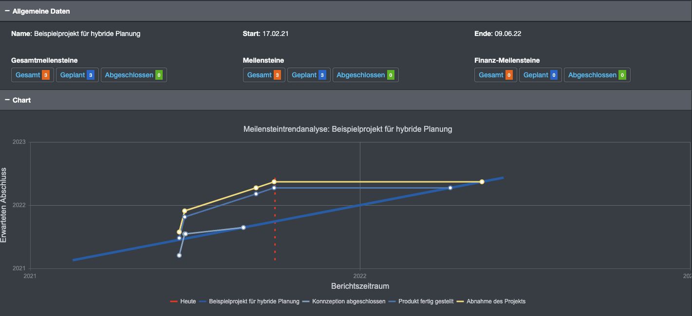
Unfortunately, this standard analysis has been forgotten in recent years. However, it has seen a resurgence in demand lately, prompting us to develop an app for it.
Every change in milestone timing (documented in the milestone's history) is analyzed by the app. Can Do keeps track of when the milestone was shifted and what the new milestone date is. These two dates are plotted on a chart, with the date of the change on the X-axis and the (new) milestone date on the Y-axis.
If the milestone is pushed back in time (delayed), the line goes up, indicating a less favorable trend.
If the milestone is expected earlier, reflecting a more positive trend, the line goes down.

So if the milestone, for example, keeps getting pushed back, the line shows an upward trend, which is considered negative.
The 'thick' blue line drawn across the diagram goes from bottom left (project start) to top right (project end). If the milestone is beyond the project end (very bad), the point would be below the line.
It sounds complicated at first, but it's actually not. You just need to know that when the line goes up, it's bad.

By the way: In some 'textbooks,' the term 'successful project management' is used for a zigzag line. The trend is negative (upward), the project manager intervenes (downward), and so on.
All milestones of a project are displayed. In the color legend below, the display of individual milestones can be toggled on and off. The graphic can be zoomed in with the mouse wheel and moved with the left mouse button.
Above the graph, some statistics about all milestones are displayed.
The app will be released for all customers free of charge in the next update cycle.
For more information, you can also visit Wikipedia: Wikipedia: MTA
As a member of the management board, Thomas is responsible for the operative management of the development including conception, design and further development of the software. He also advises customers on best practices and supports the roll-out.
Change Requests Are Part of Everyday Project Work – In Our Team Just as Much as With Our Clients
In many workshops or...
Decisions have to be made constantly in project and resource planning. What happens if an important project starts...
The ME+ app was developed to help employees and teams manage their working hours and tasks more efficiently. It is...