Enhance Project Planning with Can Do's Simulation Mode
Decisions have to be made constantly in project and resource planning. What happens if an important project starts...

With the Project Planner app, Can Do has a tool that can handle even extensive portfolios and large amounts of data. The basic rule here is that the display in the app slows down as the data increases. The reason for this is that the more objects, i.e. packages, milestones, etc., are displayed, the more the app has to draw (render) these "images" in the browser. So that everything goes fast when scrolling down and up, all objects are drawn in the background so to say.
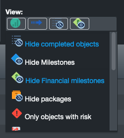
The number of objects that cause a noticeable slowdown depends on the browser used, the operating system, and ultimately the performance of the PC. Basically, however, it is always the large number of objects that makes the front end, i.e. the app, slow. Users can actively counteract this with just a few clicks. This allows the display to be changed so that it shows less content (only relevant content), which means that less rendering is required in the background. Here are a few tips for daily work with the Project Planner app on how to sensibly reduce the number of rendered objects - without claiming to be complete:


The fewer objects are displayed in the planner app, the faster the app becomes. By hiding content, temporal selection as well as filtering, the number of displayed objects is reduced without limiting usability.
As a member of the management board, Thomas is responsible for the operative management of the development including conception, design and further development of the software. He also advises customers on best practices and supports the roll-out.
Decisions have to be made constantly in project and resource planning. What happens if an important project starts...
The ME+ app was developed to help employees and teams manage their working hours and tasks more efficiently. It is...
In a fast-paced and ever-changing work environment, team and department leaders face the challenge of not only leading...